Green Light Realty
Green Light Realty is a local Real Estate company with 2 offices in Central Jersey. Their goals are to be professional, yet personal, real estate agents. There are over 50 agents employed at the company, requiring individualized marketing for each.
Business Cards & Agent Profiles
All business cards start with a designed template which is adjusted to each agent's specific marketing needs. The agent's social posts focus on making their contact information accessible to viewers.
Agent Website
The Agent Portal is a backend website for agents to obtain information and documents from the company. It works off a Google site that is connected to Google drive. This allows filing of real estate documents to be intertwined with the website. Many Google forms were created to allow the agents to input information to the company for filing.
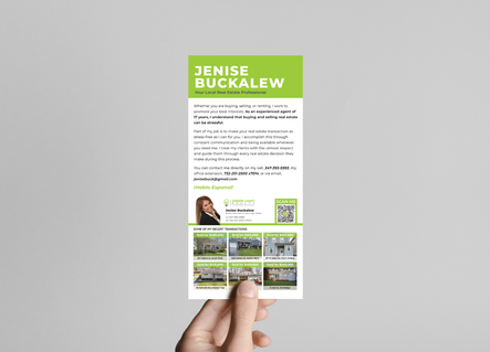
Mailers
Marketing with mailers requires constant touch points. This means mailers need to be sent monthly or bi-monthly to keep the agent's momentum. Designs either focus on holidays or sales of houses. Most designs use original vector art, others use photographic images.
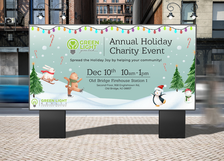
Billboards & Signs
The billboards and signs made for agents were created conforming to regulations from the state, in regard to marketing and advertising. Each billboard was personalized to the agent's needs and design preferences, while keeping compliant with Green Light Realty's brand guidelines.
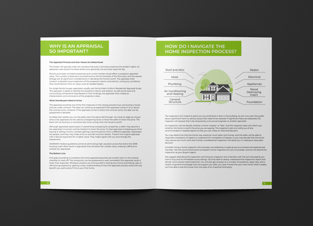
Client Collateral
Some client collateral includes a Buyers Guide and a Closing Checklist. The goal of these designs is to accurately deliver complex information to clients in the simplest way.
Marketing Materials
The goal of the marketing material is for agents to grab engagement from viewers through focused information, eye catching images and graphics, or straight to the point designs.
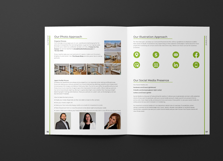
Handbook
The first section of this handbook was focused on the branding and culture of the company, therefore it had a more lively tone. The second half is more informative for agents to be able to reference information, so it had a less playful design.
Green Light Gives Back
This was the charity section of the company. I worked to create the logo design that would be similar to the main logo. This logo had a more friendly appearance, as opposed to the corporate look of the company logo. From this, I created designs for the charity event that could be implemented across multiple mediums.


